

Blueheart App
Blueheart is a tech therapy company that provide exceptional relationship therapy through their app and online platform.
I worked for Blueheart as their UX/ UI Product Designer creating multiple new features, digital artwork, animation, character design and optimisation of UX flows to bring a more complete experience and creative feel to the app.
For more information about Blueheart please visit their website: blueheart.io

01
Experience Points 'XP'
A daily points collection logic and visual design that shows users their progress through key planned sessions. The feature provides incentives and celebration on completion of therapy sessions. I designed a sliding animated progress bar with a pulsing heart that represents the experience points. The heart has a leaf inside expressing growth. When the final session of the day is completed and all points have been collected the user sees a confetti pulsing heart animation.
Collecting experience points leads to successful progression through therapy methods and plans developed by professional relationship therapists. Users and partners are synced inside the app and they progress through sessions together.
I designed the digital art, animation and UI/ UX for a badge reward levelling system. Users collect points and are guided to progress through the badges to unlock community gifts. The growth of the users are represented by live 'growing' plant pots. Each person in the couple has a pot and it grows as the user collects more points. This was a 'sticky' feature developed to bring a fun, both frequent and long term use of the app. Daily XP guides users through sessions in a specific order by opening points up for specific sessions. The character asset displays to users visually that the therapy sessions can be completed more than once and that the app is acting as a friend; always ready to help and grow with them. The track page of the app breaks down the partner growth in both an artistic and statistical view. A linked partner XP total provides a feel of teamwork and unity.


The process of developing and implementing this feature began with requirements, definition and analysis of XP concepts and how they would work with the current app flow. The decision was made that XP were a daily collection after user testing and exploration of competitor apps and first design flow prototypes. The feature assets were then planned and designed in multiple forms, then visually tested through test mode integration with the current app. They were then visually reviewed against the company branding. All feature aspects were then reviewed individually and collaboratively before being released to a small set of clients and users for monitoring. Small alterations of button positioning was tweaked and then the app was released to users.

02
Audio Page Redesign
Three gentle, abstract and artistic audio page session redesigns that can be randomly picked for any audio session content within the app and hold an engaging nature. I designed three audio page themes with simple audio controls and script view transitions, soft animations and artwork that developed the companies branding to a more powerful experience. The names of the themes are Shapes, Waves and Abstract Beach.
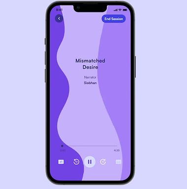

Many audio player designs were generated into prototype form at the beginning of development of this audio player session redesign. These designs included different button placement and audio control visuals, still image based backgrounds, interactive controls that fill the screen and versatile animations that move gently with any audio and fill the screen. After multiple comparative user testing of the older version of the session screens and use VS each newly generated concept; gentle and artistic animations performed best against the criteria of engaging, versatile, fun and artistic. Many animation designs were built into prototypes and reviewed before the final three were chosen.

03
Interactive Question Sessions
I had the job to redesign the current question session which consisted of blank pages, text and a next button; to a more interactive display that worked the same as the current version but looked more visually engaging and also brought in the brand of Blueheart through new artwork and animated asset flows.
Brief: The current talk sessions within the app are plain question pages with a next and back button. User’s talk through a question and then go to the next. The redesign of this feature needs to be visually engaging and include the same flow as the original pages. However, the presentation needs to be more fun and have some movement so that the user feels good going through the questions with their partner and can see their progress through the session.
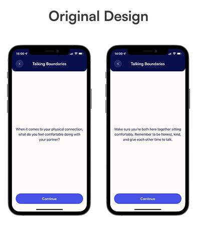
The redesign is in the form of a card deck. A question opens, the user discusses the question on the card with their partner. If they require a conversation starter or helper, they can click to open the helper card which shows previous notes that the question is based on from previous therapy sessions. When they have finished discussing the topic the user clicks on the next button and the next card is animated. A progress circle is included in the design to show how many questions are left along with the visual artwork of the card deck. This provides a clear and satisfying experience.


User testing and monitoring was important throughout the development of this design. However, the session flow format had to be maintained like the original design. This is because it was built by therapist methods, so only visual interaction and informative assets could be used to upgrade the design.
04
Journal Design Upgrade
This feature was the design of assets and flow for a better journal interaction. Initially the user had a plain main journal scroll view page with a date stamp on the entries. On the original design, when the user clicked the journal button, they write notes on a blank page, press back and they were directed back to the main journal page.
Brief: The current journal section of the app is a plain scroll view showing the user’s entries with a date stamp. When the user finishes their entry, nothing happens, there is no success or completion reinforcement feature. The journal pages of the app need to be kept simple but include assets and interactions that remove the plain experience.

I created emotion/ feeling stickers for entires, changed the header colour of the journal entry page to make it feel like you are inside the journal, I introduced a book like asset to display a word count and entry count to show progress and link to the rest of the app. I also designed an entry completion animation to bring the experience to life.


An additional concept to grow a more engaging journal section of the app was the linking to the rest of the app through library content recommendations and unlock-able visual assets. These assets (a new journal pen etc.) are based on the user's journalling behaviour and can be gained when certain milestones are checked off.
05
Post Session Feedback
A fun a fast design involving faces for ratings and fast direction of user flow. After only a selected number of sessions, the user will see a feedback rating pop up on their homepage, the user can swipe down and close the feedback if they don't want to complete it at anytime. To complete the feedback they simply choose a star rating, the face will animate and they have the option to complete a text feedback box. Once they have finished they are greeted by a thank you animation and the popup disappears. The text box and rating was a requirement for this feature in order to collate the correct insights for the company.


06
Anxiety Relief Interaction
Dance It Out is a concept and prototyped interactive feature developed to help relieve anxiety with mindfulness.
Mindfulness: Gently concentrating on looking for the next motion and the excitement/ anticipation of when the next release will be. Behavioural therapy can be in the form of completing a mindful task to remove tension, worry, anxiety, stress with cognitive distraction.
Being guided : Through the motions and sequences in which they appear. The motions could appear in a timed sequence and as the user completes a motion they could be asked to breathe in or out for longer. The motions then can sync the user into a breathing pattern such as double exhalation.
Release : As the user moves their figure through the motions the figure will occasionally release animation. As the session goes on the colours and releases can transition and become less and less until the releases in total calm the user down.
Dance : A physical and emotional release of energy.
Audio/ calming music that is in sync with the motions could be incorporated.
As you use it each day different releases can be experienced, new figure poses can be unlocked, new themes of figures can be unlocked and customised.
At the end of the dance session there can be a video capture of the figure moving through that particular session. To replay the dance for fun.

As the UX/UI Designer at Blueheart I also helped upgrade the website landing page to produce a more polished and bold look. You can see the current website at blueheart.io
